Project background
-
Mindme was founded in 2017, with yoga as a guide, through rich and perfect courses, professional guidance, high-end and diversified salon activities, etc., to connect different fields, different ages of yoga enthusiasts, to build a green "soul clean place" for them, no burden to enjoy sports pleasure, harvest healthy life, and ultimately seek inner peace.
项目背景
-
坐忘瑜伽成立于2017年,以瑜伽为引,通过丰富完善的课程、专业悉心的指导、高端多元的沙龙活动等,联结不同领域、不同年龄的瑜伽爱好者,为他们构筑一处绿意盎然的“心灵净地”,无负担地享受运动愉悦、收获健康生活,最终寻求到内心的宁静。
-
坐忘瑜伽成立于2017年,以瑜伽为引,通过丰富完善的课程、专业悉心的指导、高端多元的沙龙活动等,联结不同领域、不同年龄的瑜伽爱好者,为他们构筑一处绿意盎然的“心灵净地”,无负担地享受运动愉悦、收获健康生活,最终寻求到内心的宁静。


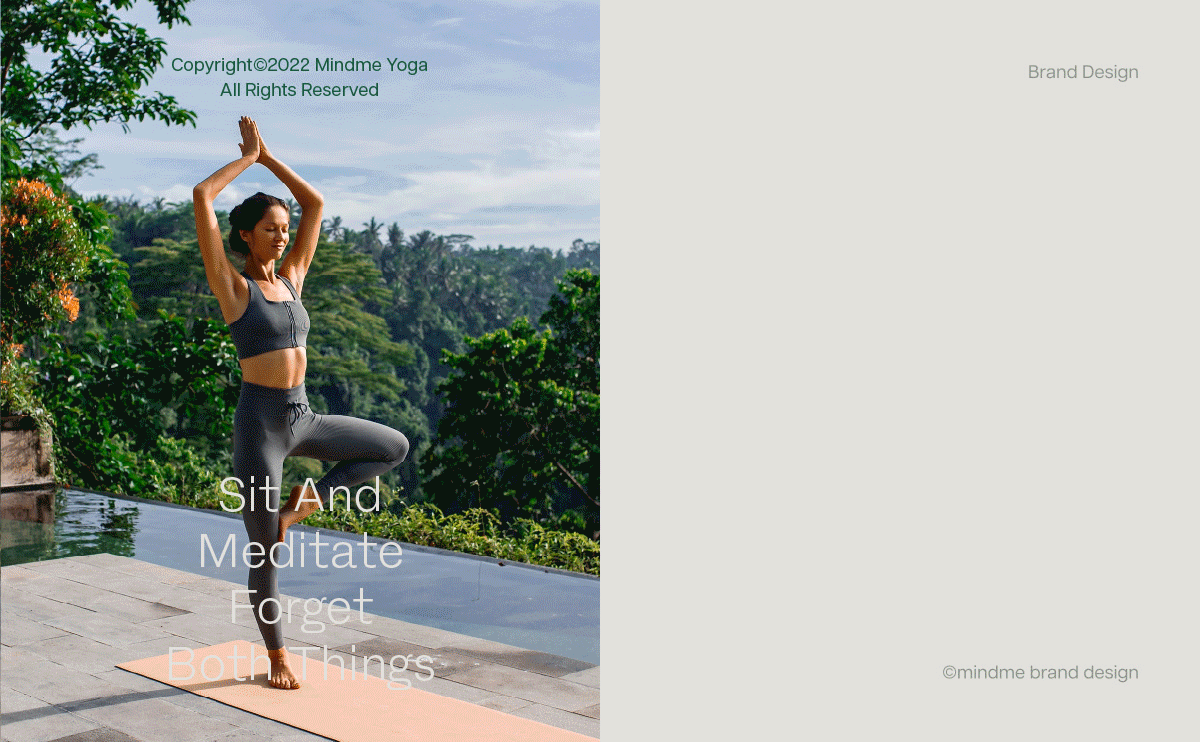
Mindme· Sit and forget
The Forest yoga studio in the city
-
Get used to the hustle and bustle of city life
A moment of peace is a luxury of the mind
In a fast-paced cement forest
Is it possible to hide a true spiritual green space?
Hide in the market, sit and meditate
Living in the forest, I forget two things
Mindme - Forest Yoga Studio in the city
Press Pause for your busy city life
Let beauty and health flow quietly in yoga
mindme·坐忘
都市里的森林瑜伽馆
-
习惯了都市生活的喧嚣
片刻的宁静都是一种心灵的奢侈
在快节奏的水泥“森林”里
是否有可能藏着一片真正的精神绿地?
隐于市,坐而静心
栖于林,物我两忘
坐忘瑜伽——都市里的森林瑜伽馆
为你的繁忙都市生活按下“暂停键”
让美好与健康在瑜伽运动中静静流淌
都市里的森林瑜伽馆
-
习惯了都市生活的喧嚣
片刻的宁静都是一种心灵的奢侈
在快节奏的水泥“森林”里
是否有可能藏着一片真正的精神绿地?
隐于市,坐而静心
栖于林,物我两忘
坐忘瑜伽——都市里的森林瑜伽馆
为你的繁忙都市生活按下“暂停键”
让美好与健康在瑜伽运动中静静流淌

Build brand temperament
Nature, peace, self
-
The design must have the brand's own genes and characteristics, so that users can recognize our temperament in a second. Through brand research, we extract the three keywords "nature, quiet, self", and then design around these three points, emphasizing the core values advocated by the brand - "explore a healthy and beautiful lifestyle".
塑造品牌气质
自然、宁静、自我
-
设计上必须具备品牌自身的基因与特征性,才能让用户一秒钟识别我们的气质。通过品牌调研,我们提取了“自然、宁静、自我”三个关键词,进而围绕这三点设计,强调品牌所倡导的核心价值观——“探索健康而美好的生活方式”。
自然、宁静、自我
-
设计上必须具备品牌自身的基因与特征性,才能让用户一秒钟识别我们的气质。通过品牌调研,我们提取了“自然、宁静、自我”三个关键词,进而围绕这三点设计,强调品牌所倡导的核心价值观——“探索健康而美好的生活方式”。

Stretched curve symbol
Strengthen yoga cognition
-
We soften the sharp strokes, round outside and square inside the font, both soft and strength, more in line with the cognition of yoga. In the design of the English logo, we adopted an all-lowercase design, and the brand initial letter "m" evolved into a simple stretch curve, forming a unique memory point.
舒展的曲线符号
强化瑜伽认知
-
我们把尖锐的笔画柔软化,外圆内方的字形,柔与力量兼具,更符合对瑜伽的认知。在英文标志的设计上,我们采取了全小写的设计,并将品牌首字母“m”演变为简约的舒展曲线,形成独特的记忆点。
强化瑜伽认知
-
我们把尖锐的笔画柔软化,外圆内方的字形,柔与力量兼具,更符合对瑜伽的认知。在英文标志的设计上,我们采取了全小写的设计,并将品牌首字母“m”演变为简约的舒展曲线,形成独特的记忆点。


Forest and peaceful colors
Feel the healing power of yoga
-
According to the brand tonality of Mindme, we chose the brand color of forest, fresh and quiet: green and beige. Green is the call of nature, full of upward vitality, people can not help but take a deep breath, enjoy the spiritual spa brought by yoga; Beige is gentle and quiet, and at the same time presents the lightness of yoga.
森系而宁静的色彩
感受瑜伽的治愈力量
-
依据坐忘瑜伽的品牌调性,我们选择了森系、清新、宁静的品牌色彩:绿色和米黄色。绿色是自然的呼唤,充满了向上的生机,让人忍不住深呼吸,享受瑜伽带来的心灵spa;米黄色是温柔而静谧的,同时又呈现着瑜伽的轻盈曼妙。
感受瑜伽的治愈力量
-
依据坐忘瑜伽的品牌调性,我们选择了森系、清新、宁静的品牌色彩:绿色和米黄色。绿色是自然的呼唤,充满了向上的生机,让人忍不住深呼吸,享受瑜伽带来的心灵spa;米黄色是温柔而静谧的,同时又呈现着瑜伽的轻盈曼妙。